Design for music, merch, and the like.
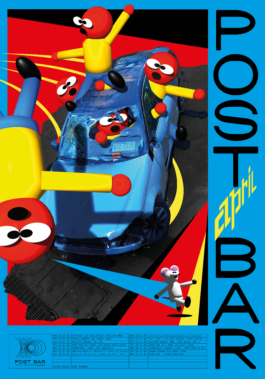
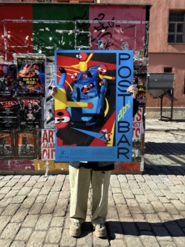
Post Bar, April 2025
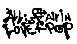
Art and lettering for Post Bar featuring a wild ride.
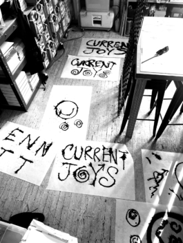
Current Joys
Lettering and merch for Current Joys, unused sadly.

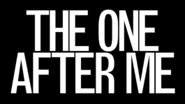
The One After Me
Title lettering and type for Seinabo Sey's ‘THE ONE AFTER ME’ — a short film by ColorsXStudios visualizing and extending Sey’s sonic storytelling and narratives. You can watch the whole cut on ColorsxStudios site. Thanks CD/AD Felix Huettel.
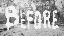
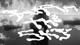
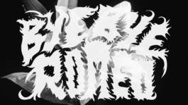
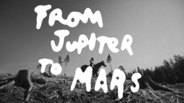
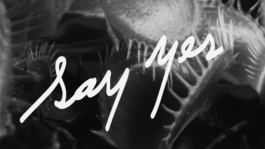
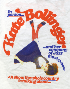
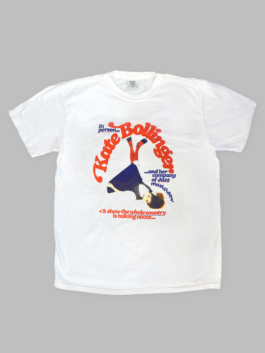
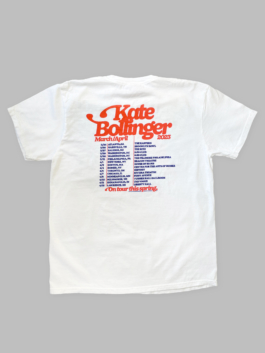
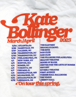
Kate Bollinger Spring '23 Tour Shirts
Shirts in support for Kate Bollinger's Spring 2023 US Tour with Tennis. The design features a customized version of DOYLE by Sharp Type with 70's inspired swashes that are inspired by the classic Fender guitar headstock. Photo by Myles Katherine.
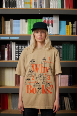
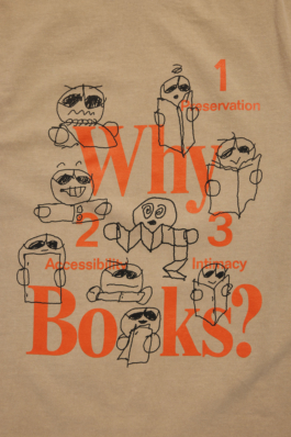
Actual Source Why Books? 2.0
Actual Source invited me to reinvision their iconic 'Why Books?' shirt in Summer 2022. I drew a series of responses inspired by my time as a student in the Independent Publishing electives at Pratt Institute, taking iconic zine formats from assignments and archives to explore the joys, quirks, and mysteries of artist-made books.
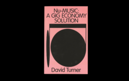
Nu-Music: Book Cover
Cover design for David Turner of Penny Fractions, a music-industry newsletter focusing on phenomenon of explotation withinthe indie-music-meets-tech-monopoly-streaming landscape. The crux of the essay was about some parties getting more than others, so I created a grotesque and imbalanced musical note.
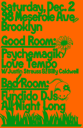
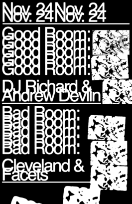
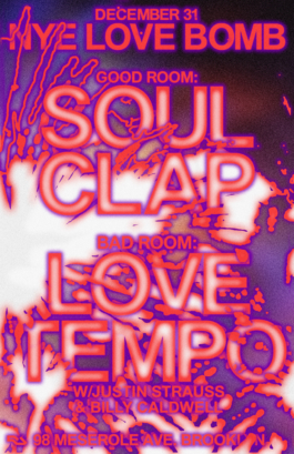
Good Room
Creative Director: Lauren Murada, Josh Houtkin, Braulio Amado.
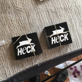
Heck Sticker
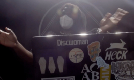
A sticker for Heck, a now defunct house venue in Brooklyn. From the entrance of the space (in a low basement) you could see a PETA poster hanging in a neighbor's bedroom. The picture here right is from DREAMCRUSHER's PBS Live appearance on Sound Field. When I saw this performance it reminded me that this sticker existed. I'm not sure I ever actually got one once they were printed?
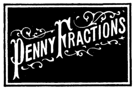
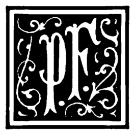
Penny Fractions
Typographic mark/icon/header for Penny Fractions, a weekly newsletter by David Turner which focuses on labor in the music streaming business. David was super interested in wood block print pamphlets, so I built a typographic mark based on an old sourced material, rearranging and adding to character forms.
